In this task, students work together to create live data visualizations of a dataset about Marvel movies. Each student is given a data card that provides information about one movie, the student’s job is to play the part of “data point” as the class works to physically organize themselves into ‘live’ visualizations of the data. The data provides opportunities for students to organize themselves into bar graphs, histograms, and scatter plots.
Introduction
Start by explaining to students that each of them is going to represent one data point in the creation of a live data visualization. Let them know they will be given a data card that tells them information about one Marvel movie.
Explain to students some of the details of the dataset they will work with. The data set contains all of the Marvel movies released in the past 10 years. Marvel has made many, many movies! This data set consists of 34 movies, all released between 2011 and 2021. We have excluded those that were rated R, and those that were animated. Each data card contains data on the following variables for each movie:
- Title
- Genre(s)
- Release Year
- Average Audience Rating (an average rating on a scale of 1 to 10)
- Runtime (in minutes)
Share with students from where this data was sourced. Some students may be curious about how the movies are rated. These ratings were recorded from the Internet Movie Database (IMDb) which allows registered users to cast their rating for each move. Each users rating is out of 10, then IMDb displays the average of all ratings.
Dataset sources
https://www.kaggle.com/promptcloud/all-marvel-cinematic-universe-movies-on-imdb
and updated using https://www.imdb.com/list/ls000024621/
Once you have explained to students the details of the dataset and the included variables, ask them to brainstorm different ways to use this information to organize the movies in various ways. Create a list on the board of what students come up with.
Teacher note
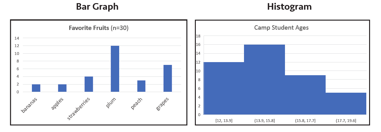
If your students are not familiar, it can be helpful to remind students about bar charts, histograms, and scatter plots. A bar graph is used to represent categorical data (e.g. genre, type). Each bar represents a different variable, and the height is based on the frequency of that variable. Histograms are used to represent numerical data (e.g. numerical measures, ratings) in a single variable. Across the horizontal axis all the values the variable takes on are represented through “bins” or ranges of values. The height of each bar represents the frequency of that data measure. Histograms become especially interesting when working with continuous variables like decimals. For example, in the histogram below, where would you count a data point that measured 13.71428571?
Finally, scatter plots are used to graph bivariate data— or data in two variables. The x and y-axis each represent numerical measures. For example, we can plot the height of a plant (y) over time (x).
Before you implement this activity with students, you’ll want to prepare a very large x-y-axis (unlabeled) either outside or in a large indoor space. We have provided wording and values for the labels based on which type of visual you are challenging the class to create. You will need to print and cut the pages with data cards. There are 34 data cards on pages 5 through 9. Each student should have their own data card.
The handout includes six challenges you can pose to your class (2 bar graphs, 2 histograms, and 2 scatter plots). Upon the completion of each graph you might consider taking a picture of the Live Data Visual so that students can reference at least one of the graphs in a final reflection.
Included with each graph description are suggested axis labels. You can write the axis labels on paper or wipe off boards. Ask students to place the wipe off boards or paper labels out on the axis/axes. Each graph has a note on some interesting conversations/challenges students may face when creating the Live Data Visual. Note that for the bar graph and histograms, students whose data point lie in the same “bar” will want to organize themselves so that they create a rectangular bar shape (rather than standing alone to represent a point). To show that several data points/students are together creating a rectangular bar, students in that category/bin can line up and extend their arms in front of themselves to create the sides of the bar for the picture you will take of the completed Live Data Visual. Download the handout for the six challenge graphs.
